As part of my internship (LiA) at Funka.com I created clickable prototypes which were used to conduct user testing. The goal with the user test were to test 5 different types of criterions for cognitive accessibility. Two different types of prototypes needed to be created one which looks like a governmental website and one which is focus on e-learning.
This project had already been ongoing for few years, and I came in at the end of the project to create clickable prototypes for the user testing. Before I could start with the prototypes, I needed to understand the task in hand. I did an analyse of different governmental websites in Europe as well as different E-platforms. I needed to ask a couple of why´s and how´s before the creative process, to whom am I designing for? What WCAG rules do I need to take into consideration? What different types of cognitive accessibilities are there? What type of prototype is needed? What are the criteria for the testing phase? I used Miro to analyse the task in hand and creating the backlog needed for this project.
Narrowing
Based on my analyse I came up with few conclusions:
– Simplistic and generic design – Follow WCAG standard condition – What UI elements to be tested on – No unnecessary elements in the prototype – Two different prototypes would be needed for 1 criterion in order to make an A/B testing
From my dialog with the stakeholder the criterium that we should test on the prototype were:
Clickable objects are consistent and clearly distinguishable as such, Interactive elements to have similar behaviour and patterns of activation for similar actions, focus on and easy understanding of important information, Indication of progress in a visually described process of tasks, Showing users location in a set of web pages.
Idea
From analysing different governmental website across Europe and E-platforms I had a pretty good idea as to how we could present the prototypes. The colours, icons, elements, objects in the prototype need to be simple and no unnecessary clickable areas.
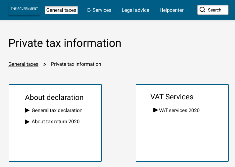
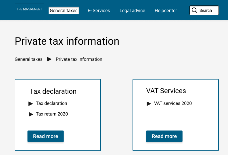
For the governmental website I used a blue colour with a light background and dark text. Focusing on tax questions which the user could navigate around. For one criterion we would also have a tax calculation form. The governmental website was targeting adults who have questions or need help with tax information.
For the e-platform we wanted to display course material targeting younger kids where they could choose to take a course and view their profile section. The colour codes that I picked was a green and pink colour with a light background.
Prototype
Within the different prototypes it contains clickable objects, interactive elements, hover functionalities, forms, and progress bar.
Criteria 1, Clickable objects are consistent and clearly distinguishable as such:
Here we would test how the user would interact with an inconsistency vs consistent clickable object. Focusing on breadcrumbs, clickable links and arrows and the goal for the user is to navigate to the Tax return page 2020.
Criteria 5, Indication of progress in a visually described process of tasks:
Governmental website: Giving the user two different types of tax calculations forms and how he/she would interact with them, based on the scenario given.
E- learning platform: One of the prototypes we would present a progress bar as well as how many steps the user have done when answering questions. The other prototype has less information given.
During the testing phases there was 5 different criteria’s to be tested during an A/B testing. The different prototypes were created based on the WCAG standard, two prototypes were created for the same criteria but one of them had “incorrect” behaviour as per the criteria set up.
I prepared the scenarios and questions for the user testing. Questions that were asked; was it easy to understand the scenario given? Why? Why not?
All user testing were done digitally due to covid-19.
For two of the criterions, they were also translated into German and tested with a focus group.
My take on the project
A very interesting project where I got to learn more about WCAG and cognitive accessibility. Everyone who use a digital service have had a cognitive accessibility of some kind, you can be stressed, tired and not thinking clearly, there could be many different kinds of accessibility issues and with this important project it highlights the importance to give and provide information in a consistent, easy and quick way.
I thought it was particular interesting about the different tax calculations forms where you can see clearly why it is important to provide feedback to the end user. We can sometimes take for granted that you do not need to provide confirmation/feedback to the user when using an input field. When giving the users steps and colours as confirmation/feedback the user will less often question its input.
Results
You can view the full project on following website: https://cogreq.eu/prototypes this demo site were set up to demonstrate the project.
About Funka
Funka.com is a private owned company which focusses on digital accessibility. Funka is one of the leading companies in Europe in the accessibility field were 80% of their customers are from the public sector. They analyse digital interfaces, educate companies about WCAG (Web content accessibility guidelines), conduct user testing and much more.
They like to say that they are one-stop-shop for accessibility and were they want to have an inclusive society where accessibility is a given for everyone.
Credits: Illustrations used by the plugin Blush, Allura by Vijay Verma.